Self-service Kiosk
Dasa
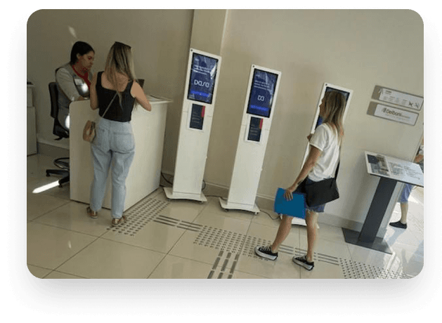
DASA is one of the largest healthcare and diagnostics networks in Brazil, with thousands of patients using its labs every day. My challenge was to redesign the self-service kiosks, creating a smoother, clearer experience without adding operational complexity or cost.
🎯 The Problem
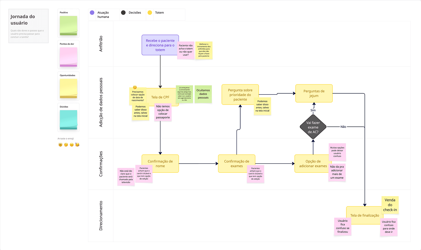
I conducted observational research and, together with stakeholders, selected the main problems to be solved. Although the existing workflow was technically functional, several usability issues impacted the patient experience:
- Users didn't know when the process had actually ended;
- Many looked for printed tickets, even though the system was entirely digital;
- Self-service kiosks provided little visual feedback on what would happen next;
- Lack of clarity generated confusion, anxiety, and unnecessary support requests;
- We didn't know if evolving with the use of peripherals such as signature pens, payment machines, or scanners was worthwhile in terms of cost versus benefit for the company.
💡 Research & Exploration
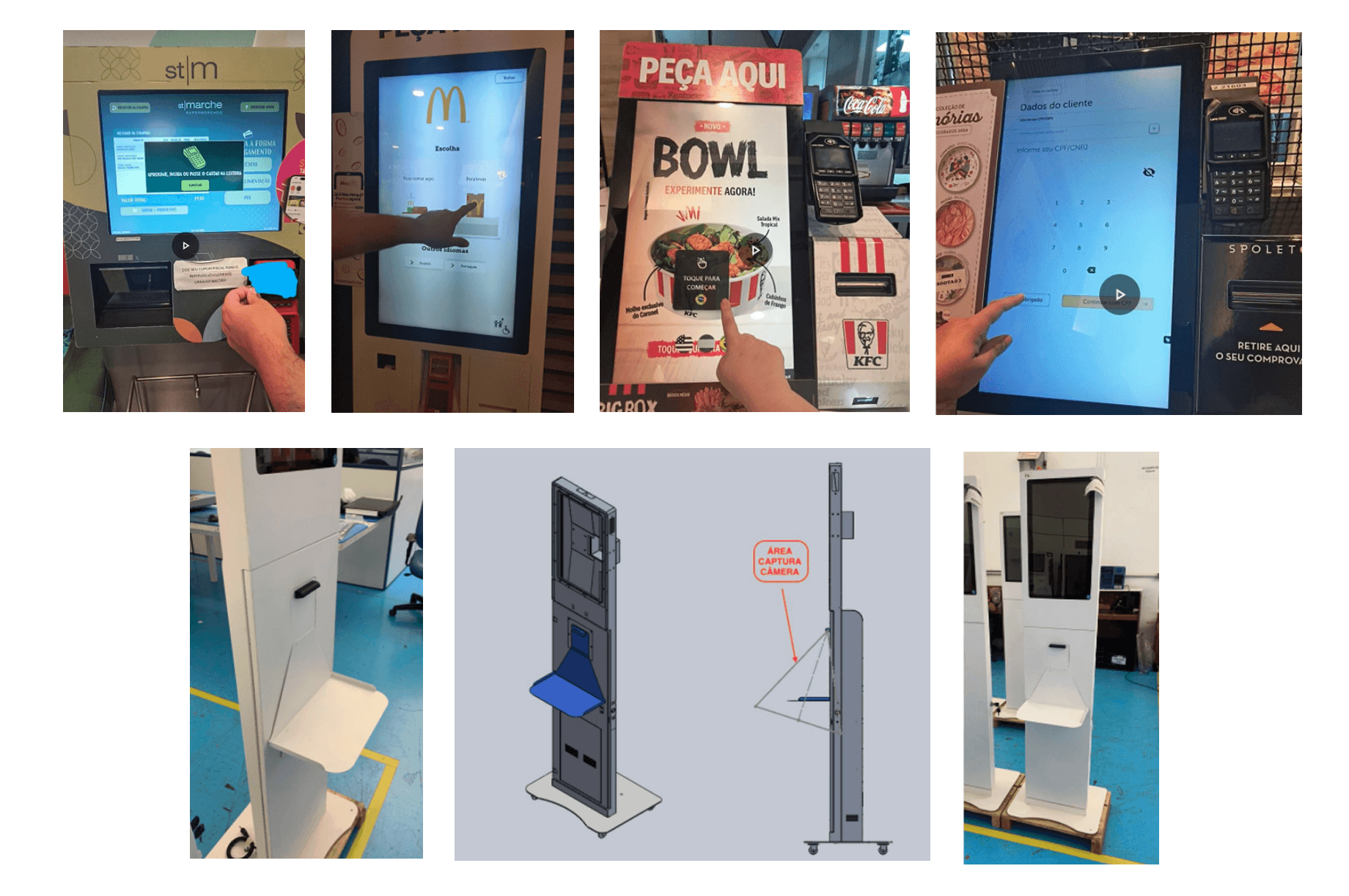
Before jumping into design, I conducted field research and benchmarking with other healthcare kiosks to understand how people interact with similar systems. During this exploration, we also evaluated the feasibility of adding peripherals to improve autonomy and accessibility:
• A digital pen for signing consent forms;
• A card machine for private exam payments;
• A scanner for uploading medical orders.
We analyzed costs, integration complexity, and user benefits for each device.
Our conclusion: the investment would be high, while the user impact would be limited. This led to a strategic decision to focus on UX and interface improvements instead of expanding hardware.
🔍 Usability test
I conducted user research to understand their main problems and identified the following:
- How to clearly communicate that the flow is complete?
- How to reduce user anxiety without physical paper?
- How to make the experience inclusive for people with different tech literacy levels?
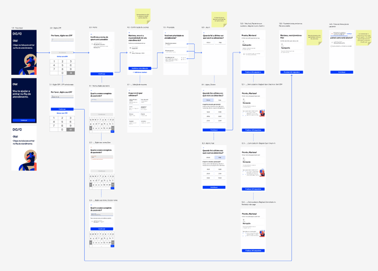
✏️ User journey
I also analyzed the current journey and listed pain points that could be prioritized as future tasks or that we could add to our MVP.
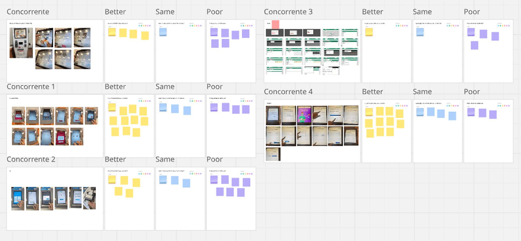
📚 Benchmark
I conducted a market analysis taking into account what they did best, what they had in common, and what we could improve.
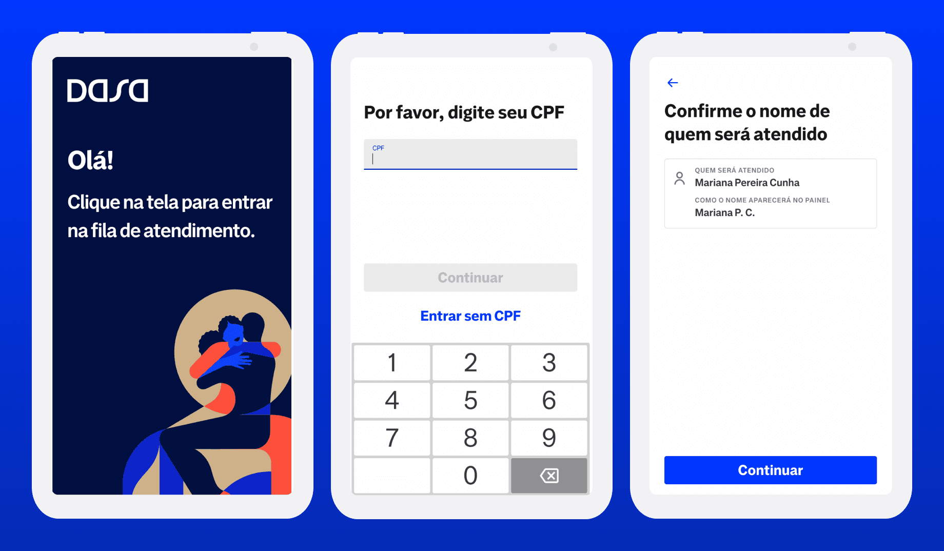
✒️ Design Solution
The redesign focused on improving the final steps of the flow, where confusion and friction were highest.
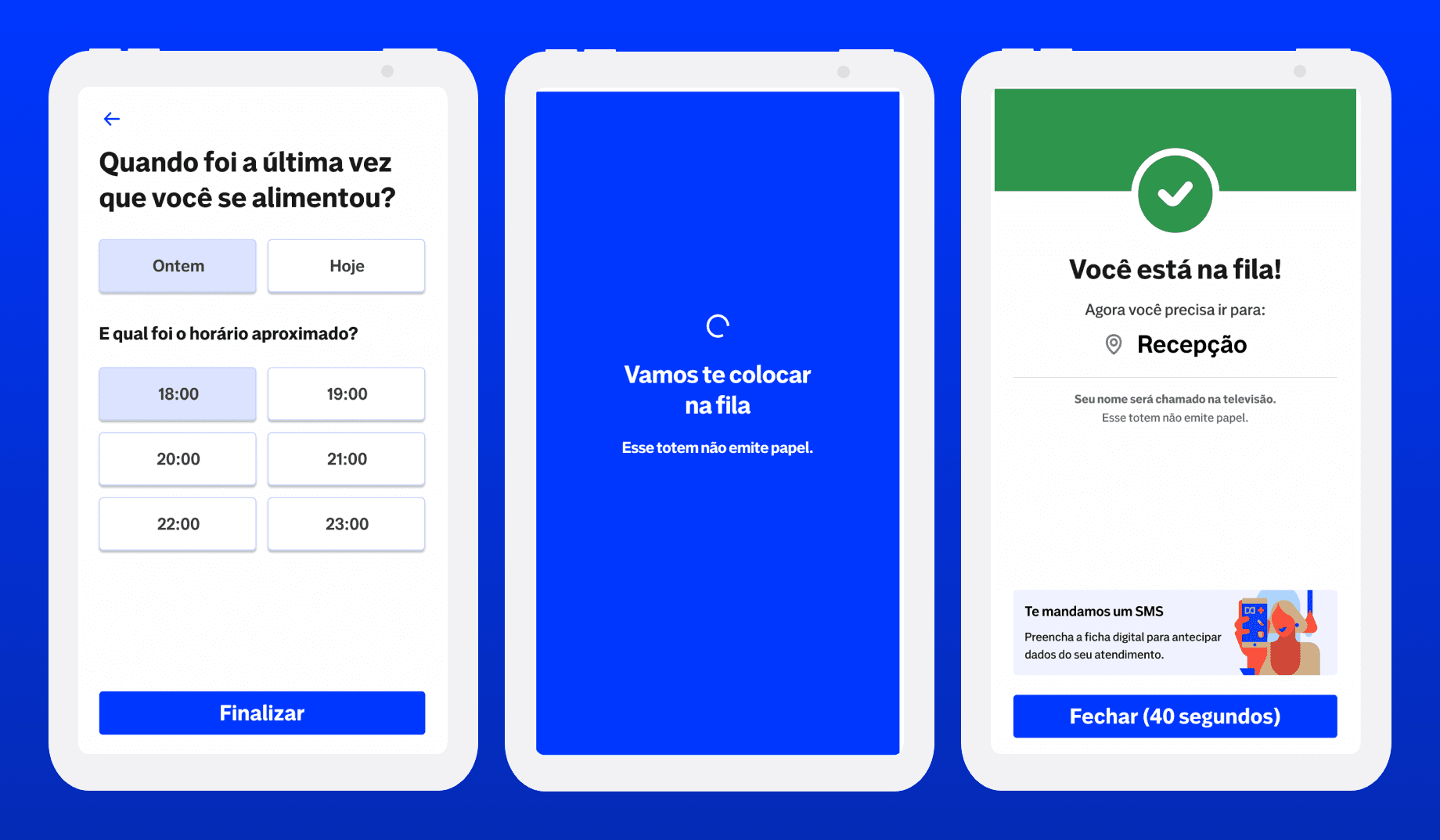
- Loading Screen: Introduced a blue full-screen loading state with a progress animation. Added clear, reassuring messages such as: “We’re adding you to the waiting list.” “This kiosk doesn’t print receipts. Please wait to be called on the screen."
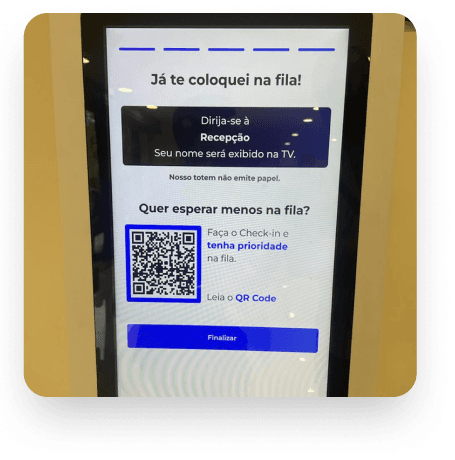
- Confirmation Screen: Transitioned to a green success screen with a checkmark animation. Simplified content to one key message: “You’re in line. Please proceed to the reception. Your name will appear on the display.” Reduced cognitive load and redundant text. Added an optional QR code for quick check-in or tracking exam status.
My Role
• Field research & benchmarking
• Hypothesis definition (UX + hardware feasibility)
• UI redesign and visual system update
• Prototype creation and usability testing
• Collaboration with product and research teams
Results
• Clearer understanding of when the flow ends;
• Noticeable decrease in user confusion and staff intervention;
• Improved communication of the paperless process.
This project reinforced the importance of visual feedback and micro-interactions in physical-digital experiences. Sometimes the best innovation isn’t adding new technology: it’s about simplifying communication and building trust through design.
Impact
A simpler, more accessible experience: helping thousands of patients feel guided and confident, even in a moment of uncertainty.
Tools
Figma · Miro · Notion · Jira · Chatgpt
Next Project
Back-office
Quinto Andar is a large real estate company here in Brazil. At QuintoAndar, I led the redesign of Magic Link, an internal back-office platform used by support analysts and managers to handle all customer interactions.Previously, the platform was confusing and fragmented. Analysts needed to open at least five different tools to complete a single case. My goal was to centralize workflows, simplify navigation, and build a shared understanding of users and their processes across the company.
View ProjectLet's talk
I will reply to you as soon as possible.